SplxtterPxint
Member
- Jul 6, 2020
- 45
- 158
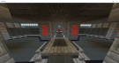
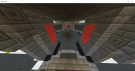
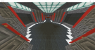
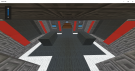
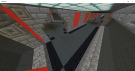
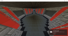
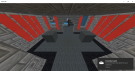
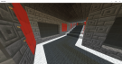
Map Name: Castle
Builder: SplxtterPxint43
Minigame: SPLT/Splatter
Link: Soon To Come
Should I Finish Map Yes Or No?
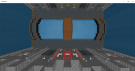
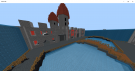
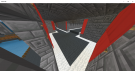
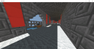
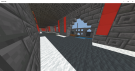
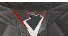
Picture:
Builder: SplxtterPxint43
Minigame: SPLT/Splatter
Link: Soon To Come
Should I Finish Map Yes Or No?
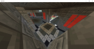
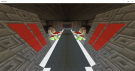
Picture:
Attachments
-
 Pic 1.png1.3 MB · Views: 43
 -
 Pic 2.png1 MB · Views: 43
 -
 Pic 3.png468.9 KB · Views: 41
 -
 Pic 4.png492.3 KB · Views: 41
 -
 Pic 5.png568.3 KB · Views: 41
 -
 Pic 6.png448.1 KB · Views: 41
 -
 Pic 7.png542.7 KB · Views: 41
 -
 Pic 8.png453.9 KB · Views: 41
 -
 Pic 9.png647 KB · Views: 41
 -
 Pic 10.png507.6 KB · Views: 41
 -
 Pic 11.png461.6 KB · Views: 42
 -
 Pic 13.png462 KB · Views: 42
 -
 Pic 14.png547.6 KB · Views: 42
 -
 Pic 16.png574.5 KB · Views: 42
 -
 Pic 17.png428.8 KB · Views: 42
 -
 Pic 19.png454.6 KB · Views: 42
 -
 Pic 20.png386 KB · Views: 42
 -
 Pic12.png492.3 KB · Views: 42
Last edited:


 It looks great, I’m sure the builders can give you feedback!

