lovebyexsamaeli
New Member
- May 24, 2020
- 14
- 37
I just want to start off with all the people that gave me feedback in the last post. I learned from a couple comments. Thx to all the people ")
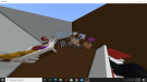
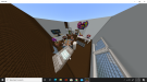
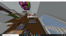
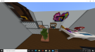
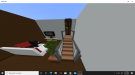
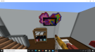
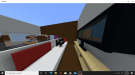
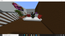
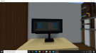
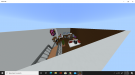
This theme is Giant House. I tryed my best to stick with the theme and not go all out. Simple and nice.
I hope all of you enjoy this post,
PLEASE GIVE ME CRITICAL FEEDBACK ON WHAT I SHOULD FIX IN MY NEXT MAP. BE HONEST
This theme is Giant House. I tryed my best to stick with the theme and not go all out. Simple and nice.
I hope all of you enjoy this post,
PLEASE GIVE ME CRITICAL FEEDBACK ON WHAT I SHOULD FIX IN MY NEXT MAP. BE HONEST
Attachments
-
 Screenshot (83).png1.1 MB · Views: 34
 -
 Screenshot (81).png996.2 KB · Views: 35
 -
 Screenshot (82).png964.7 KB · Views: 33
 -
 Screenshot (84).png834.5 KB · Views: 35
 -
 Screenshot (85).png894.3 KB · Views: 32
 -
 Screenshot (86).png793.7 KB · Views: 34
 -
 Screenshot (87).png892.2 KB · Views: 32
 -
 Screenshot (89).png1.2 MB · Views: 30
 -
 Screenshot (90).png1.1 MB · Views: 32
 -
 Screenshot (91).png463.3 KB · Views: 30
 that plant pot could be a tad smaller too and mixed with different browns (or whichever block you’re using) you could always add lamp shades to you know.. the lamps just to make them look a bit cleaner as well qwq