Navigation
Install the app
How to install the app on iOS
Follow along with the video below to see how to install our site as a web app on your home screen.
Note: This feature may not be available in some browsers.
More options
Style variation
You are using an out of date browser. It may not display this or other websites correctly.
You should upgrade or use an alternative browser.
You should upgrade or use an alternative browser.
Rate my drawings
- Thread starter Jqzzyy
- Start date
- May 29, 2019
- 1,970
- 9,300
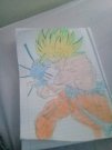
WOW THATS SO GOOD!!!Rate.
ilikethaifood
Notable Member
- Mar 28, 2020
- 4,859
- 56,782
nice
View reply.
- Mar 30, 2020
- 1,849
- 14,043
like what @/seacosmos said :3
maybe adding a more bold outline will make it pop out more! and maybe colour it in? so that the colours can also pop out and make the whole drawing look brighter! :3
overall, it’s really nice! keep it up! :3
View reply.
maybe adding a more bold outline will make it pop out more! and maybe colour it in? so that the colours can also pop out and make the whole drawing look brighter! :3
overall, it’s really nice! keep it up! :3
Yuuchan02
Notable Member
- Mar 28, 2018
- 320
- 11,572
The "drawing" itself is really good, I'd give it 7.5 for the detail.
The thing that kinda bothering is just the shading, could've been done more, as You already have the basic colours laid out. It will be rough if You never tried it, but I guess You could improved.
Try to make an illusion by using the shading technique. You know, like the one that can make You think it's 3d.
View reply.
The thing that kinda bothering is just the shading, could've been done more, as You already have the basic colours laid out. It will be rough if You never tried it, but I guess You could improved.
Try to make an illusion by using the shading technique. You know, like the one that can make You think it's 3d.
joongie
Notable Member
- May 21, 2020
- 460
- 5,065
It looks good, nlg. However, there are some things that need improvement so I'll get into that:
-Try making the lineart more noticable. This can really help the drawing pop out and easier to tell from far distance.
- Practice methods of coloring. Base colors feel a bit messy. Make sure to fill in all those white spots to give it that clean look!
- Add shading! This can give more feeling to the drawing. Either soft shading or cell shading could work, depending on your artstyle. Dont really know much about DragonBallZ, but adding a light source from the kamemeha wave could really make you feel what's going on.
-Work on color blending! The transitions of colors can give the drawing a really good touch!
These are just my opinions, buy overall you did good! 7.5/10 !
!
View reply.
-Try making the lineart more noticable. This can really help the drawing pop out and easier to tell from far distance.
- Practice methods of coloring. Base colors feel a bit messy. Make sure to fill in all those white spots to give it that clean look!
- Add shading! This can give more feeling to the drawing. Either soft shading or cell shading could work, depending on your artstyle. Dont really know much about DragonBallZ, but adding a light source from the kamemeha wave could really make you feel what's going on.
-Work on color blending! The transitions of colors can give the drawing a really good touch!
These are just my opinions, buy overall you did good! 7.5/10
!- Oct 21, 2019
- 728
- 8,807
100000000000/10Rate.