

- Aug 24, 2018
- 327
- 9,233
Greetings, it is I KnightWalker49
Today I bring you another entry in the Builder's Blog, where we learn building techniques and talk about anything related.
For this entry, I will be discussing how to pick blocks based on a colour pallet. I will also cover how to make a good colour pallet based on context. This entry is aimed at beginners, or intermediate builders who need some reminders. However you may still find it interesting so just read along regardless.
What is a "colour pallet"?
A colour pallet, in the context of building in Minecraft, refers to the colours of the blocks used in a build which compliment one another; this may also refer to the build's colour pallet complimenting the terrain around it. Colour pallet is one of the essential things you need to know when building, having a good colour pallet will help you choose blocks you want to use when building, it can help make your builds more consistent; especially when you are building a town.
Now, how do you determine what colour pallet to use? Well it's simple, think of a theme for your build! If you are going for a standard Minecraft medieval theme, then a mixture of brown and grey would best fit the build (e.g. oak, spruce, stone and variants). I strongly recommend searching around the internet for pictures of what you are going for as reference, having a few pictures as reference will help you stick to what you have in mind without going outside the box a bit; it will also help in deciding what colour pallet to use.
Let me give you an example on how you can determine a colour pallet, if you look at figure 1 I've chosen a cold mountain area for a build. From what I know, generally houses in areas like this often use a mixture of stone and dark stained wood or something so with that in mind, I will choose blocks that are appropriate.

fig. 1: Terrain with possible blocks to use in a build.
And now that I've chosen a terrain and a good colour pallet, I will now proceed to build a structure based on those blocks:

fig 2. What I managed to build using those blocks, to be honest it doesn't really look that impressive.
This house compliments the area around it, from the resources already available to the overall design. This build was inspired by a picture I found online (see figure 3) so it really shows how references can help you with ideas; you don't necessarily need to copy every single aspect of the reference, you can just use to to get ideas; which is what references are for.
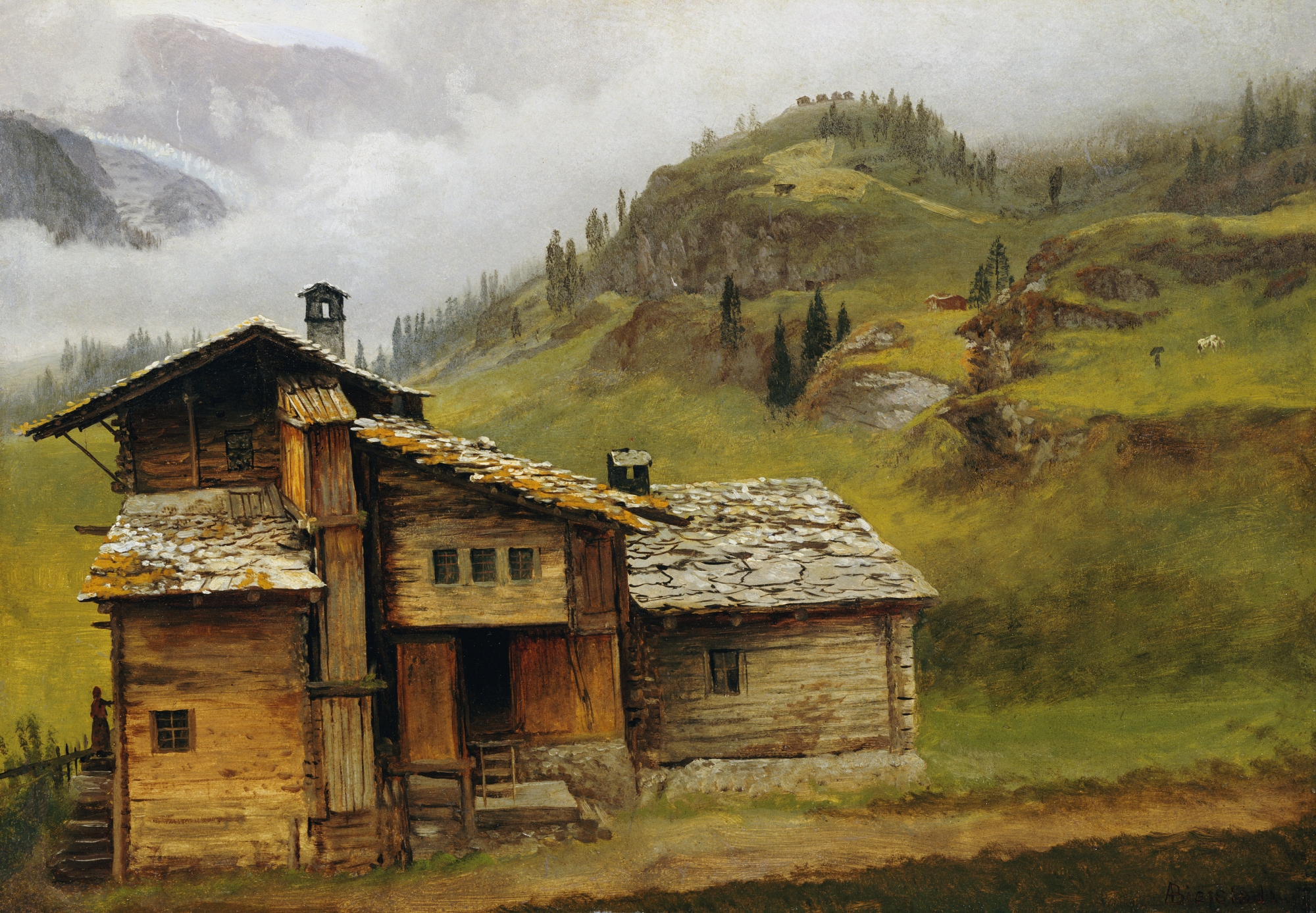
fig. 3: Source: https://commons.wikimedia.org/wiki/File:Albert_Bierstadt_-_Mountain_House.jpg
It's really that simple, just think of the area around you and get the sense of the context of the area because you can't build a sand castle in the middle of a swamp; because there's little to no sand in swamp biomes. Speaking of which, I might as well show you what blocks I would use when building a house in a swamp:

fig. 4: Moist swamp, not really good for anything else other than clay or something. Why would you even consider living here?
By looking at figure 4, what have you noticed? Well, what I noticed is that it's dark so I will use blocks that are also dark. And since this is a swamp, I should make things overgrown but at the same time fairly maintained as someone lives there. Those are the things I will keep in mind. Now, this is the finished product:

fig. 5: This is more like it, simple yet effective. I would probably live there.
Again, choosing a good colour pallet is really simple if you know the theme of your build and the context of the terrain.
Now, if you have progressed far in your building, you can probably get away with using every colour on the rainbow. Here's a wonderful example of colours complimenting one another, this is a build by the blockworks build team:

fig. 6: Source: https://www.reddit.com/r/Minecraft/comments/33i582/happy_earth_day_heres_an_old_build_our_team_did/
As you can see, this is a brilliant example of colour pallet. Well, it may not be obvious to some but the colour pallet of this build is consistent. They went for most of the bright colours will little contrast with other parts of the build to make things more balanced. Now, here's another example of a good colour pallet:

fig. 7: Source: https://www.planetminecraft.com/project/the-lost-temple-of-jinksai/
This awesome overgrown, oriental-inspired build is built by ElNakix. Since this is inspired by oriental architecture the main colour will be red (however, some cases it's orange), however being overgrown it will have a lot of green in it. The green rooves of the build compliment the terrain nicely, and the vines and leaves scatter the red to make it not too dominant. The white walls are also complimented by the grey mountain face background, making everything have this connected effect.
Don't be discouraged when looking at awesome builds like these, first of all they are using shaders and resource packs so of course it will make it look a lot better; not saying it will look bad without it, it's just that some builders rely on resource packs and shaders too much, I am here to inform you that it's not always necessary.
Now you understand the basics of picking a colour pallet, using reference images to help you with building, and you now know how to assess the terrain to pick a colour pallet. To recap: Know your build's theme, look around the area where you are building to get the context, use blocks based on the context.
Epilogue:
This took a while to make so I hope you found this article useful, if you learned something please share what you made down below. If you have any questions or suggestions on what I should cover next please leave them down below as well or message me on the Broken Lens Forum. If you have any builds you are proud of, please post them down below as I am planning on doing a bit of a "Build Showcase" showcasing builds from the Broken Lens Community; make sure to get a good photo capturing everything, and a short explanation of what the build is and where you built it (e.g. what terrain and whether or not you built it near notable features such as a river).
P.S This was scheduled to be released in 3 days, but I worked on it so hard and the excitement was killing me. So yeah, expect a new entry approximately one week from now; unless I get excited again.
I hope you enjoyed reading this!
Read the previous entry of Builder's Blog:
Entry 1-A: The Basics of Depth
https://brokenlens.xyz/forums/threads/builders-blog-entry-1-a-the-basics-of-depth.93548/#post-730377
Like what I write? Read my previous articles:
Guide on Winning at PVP
https://brokenlens.xyz/forums/threads/information-a-guide-on-winning-at-pvp.86679/#post-681141
Identifying the Players of Broken Lens:
https://brokenlens.xyz/forums/threads/information-identifying-the-players-of-broken-lens.86356/
Boop
Today I bring you another entry in the Builder's Blog, where we learn building techniques and talk about anything related.
For this entry, I will be discussing how to pick blocks based on a colour pallet. I will also cover how to make a good colour pallet based on context. This entry is aimed at beginners, or intermediate builders who need some reminders. However you may still find it interesting so just read along regardless.
What is a "colour pallet"?
A colour pallet, in the context of building in Minecraft, refers to the colours of the blocks used in a build which compliment one another; this may also refer to the build's colour pallet complimenting the terrain around it. Colour pallet is one of the essential things you need to know when building, having a good colour pallet will help you choose blocks you want to use when building, it can help make your builds more consistent; especially when you are building a town.
Now, how do you determine what colour pallet to use? Well it's simple, think of a theme for your build! If you are going for a standard Minecraft medieval theme, then a mixture of brown and grey would best fit the build (e.g. oak, spruce, stone and variants). I strongly recommend searching around the internet for pictures of what you are going for as reference, having a few pictures as reference will help you stick to what you have in mind without going outside the box a bit; it will also help in deciding what colour pallet to use.
Let me give you an example on how you can determine a colour pallet, if you look at figure 1 I've chosen a cold mountain area for a build. From what I know, generally houses in areas like this often use a mixture of stone and dark stained wood or something so with that in mind, I will choose blocks that are appropriate.
fig. 1: Terrain with possible blocks to use in a build.
And now that I've chosen a terrain and a good colour pallet, I will now proceed to build a structure based on those blocks:
fig 2. What I managed to build using those blocks, to be honest it doesn't really look that impressive.
This house compliments the area around it, from the resources already available to the overall design. This build was inspired by a picture I found online (see figure 3) so it really shows how references can help you with ideas; you don't necessarily need to copy every single aspect of the reference, you can just use to to get ideas; which is what references are for.
fig. 3: Source: https://commons.wikimedia.org/wiki/File:Albert_Bierstadt_-_Mountain_House.jpg
It's really that simple, just think of the area around you and get the sense of the context of the area because you can't build a sand castle in the middle of a swamp; because there's little to no sand in swamp biomes. Speaking of which, I might as well show you what blocks I would use when building a house in a swamp:
fig. 4: Moist swamp, not really good for anything else other than clay or something. Why would you even consider living here?
By looking at figure 4, what have you noticed? Well, what I noticed is that it's dark so I will use blocks that are also dark. And since this is a swamp, I should make things overgrown but at the same time fairly maintained as someone lives there. Those are the things I will keep in mind. Now, this is the finished product:
fig. 5: This is more like it, simple yet effective. I would probably live there.
Again, choosing a good colour pallet is really simple if you know the theme of your build and the context of the terrain.
Now, if you have progressed far in your building, you can probably get away with using every colour on the rainbow. Here's a wonderful example of colours complimenting one another, this is a build by the blockworks build team:
fig. 6: Source: https://www.reddit.com/r/Minecraft/comments/33i582/happy_earth_day_heres_an_old_build_our_team_did/
As you can see, this is a brilliant example of colour pallet. Well, it may not be obvious to some but the colour pallet of this build is consistent. They went for most of the bright colours will little contrast with other parts of the build to make things more balanced. Now, here's another example of a good colour pallet:
fig. 7: Source: https://www.planetminecraft.com/project/the-lost-temple-of-jinksai/
This awesome overgrown, oriental-inspired build is built by ElNakix. Since this is inspired by oriental architecture the main colour will be red (however, some cases it's orange), however being overgrown it will have a lot of green in it. The green rooves of the build compliment the terrain nicely, and the vines and leaves scatter the red to make it not too dominant. The white walls are also complimented by the grey mountain face background, making everything have this connected effect.
Don't be discouraged when looking at awesome builds like these, first of all they are using shaders and resource packs so of course it will make it look a lot better; not saying it will look bad without it, it's just that some builders rely on resource packs and shaders too much, I am here to inform you that it's not always necessary.
Now you understand the basics of picking a colour pallet, using reference images to help you with building, and you now know how to assess the terrain to pick a colour pallet. To recap: Know your build's theme, look around the area where you are building to get the context, use blocks based on the context.
Epilogue:
This took a while to make so I hope you found this article useful, if you learned something please share what you made down below. If you have any questions or suggestions on what I should cover next please leave them down below as well or message me on the Broken Lens Forum. If you have any builds you are proud of, please post them down below as I am planning on doing a bit of a "Build Showcase" showcasing builds from the Broken Lens Community; make sure to get a good photo capturing everything, and a short explanation of what the build is and where you built it (e.g. what terrain and whether or not you built it near notable features such as a river).
P.S This was scheduled to be released in 3 days, but I worked on it so hard and the excitement was killing me. So yeah, expect a new entry approximately one week from now; unless I get excited again.
I hope you enjoyed reading this!
Read the previous entry of Builder's Blog:
Entry 1-A: The Basics of Depth
https://brokenlens.xyz/forums/threads/builders-blog-entry-1-a-the-basics-of-depth.93548/#post-730377
Like what I write? Read my previous articles:
Guide on Winning at PVP
https://brokenlens.xyz/forums/threads/information-a-guide-on-winning-at-pvp.86679/#post-681141
Identifying the Players of Broken Lens:
https://brokenlens.xyz/forums/threads/information-identifying-the-players-of-broken-lens.86356/
Boop


